

PURE EP
Bringing clarity to health professionals with a new visual aesthetic
Art Direction, Product Brand Guidelines, Presentation Design
-
BioSig needed to shift their PURE EP product from being perceived as a "bioelectric medicine" brand catering primarily to investors, to positioning themselves as a leading "digital signal processing" technology providing the purest, clearest heart signals. This shift aimed to focus their market reach by targeting electrophysiologists (EPs), emphasizing their dedication to enhancing cardiac care through cutting-edge signal technology.
-
An updated visual product identity was essential to support BioSig’s audience expansion. We created a look and feel based on the new BioSig corporate brand, but tailored it specifically for the PURE EP audience of electrophysiologists by using darker colors and product-specific visual elements.
-
Collaborating with Copywriters and Strategists, I led the design from concept to implementation, ensuring a seamless and effective online presence for the organization. I also elevated their current brand, expanding the color palette, typography, and visual elements to amplify their presence in the digital space and ensure accessibility.
Collaborating with our Copywriter and Creative Director, I developed a product identity that aligned seamlessly with the corporate brand. This included a color palette for PURE EP as well as its own visual brand element. Additionally, I specified visual guidelines for PURE EP product within the larger BioSig company brand guide.


The PURE EP signal was designed as a central visual element of the product's identity, symbolizing the cutting-edge signal processing technology BioSig offers. Knowing that electrophysiologists often work in dimly lit rooms while analyzing signal data, I developed glowing lines to represent the continuous, end-to-end movement of the signals from the PURE EP system. This visual not only highlights the product’s technology but also enhances usability in low-light environments, creating an intuitive and visually compelling representation of the signal flow.

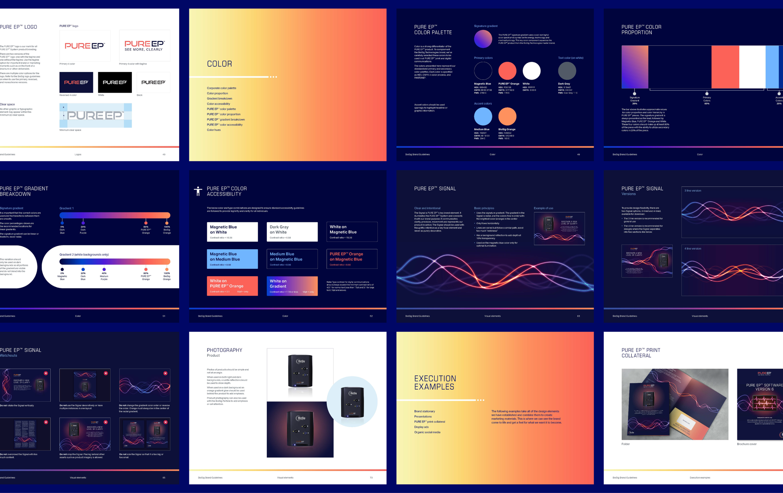
With the redesign of the PURE EP product brand we provided detailed guidelines within the overall BioSig corporate brand. I led the design and direction which included logo dos and don’ts, brand color theory, and specifications for visual elements such as the PURE EP Signal, iconography, and photography.
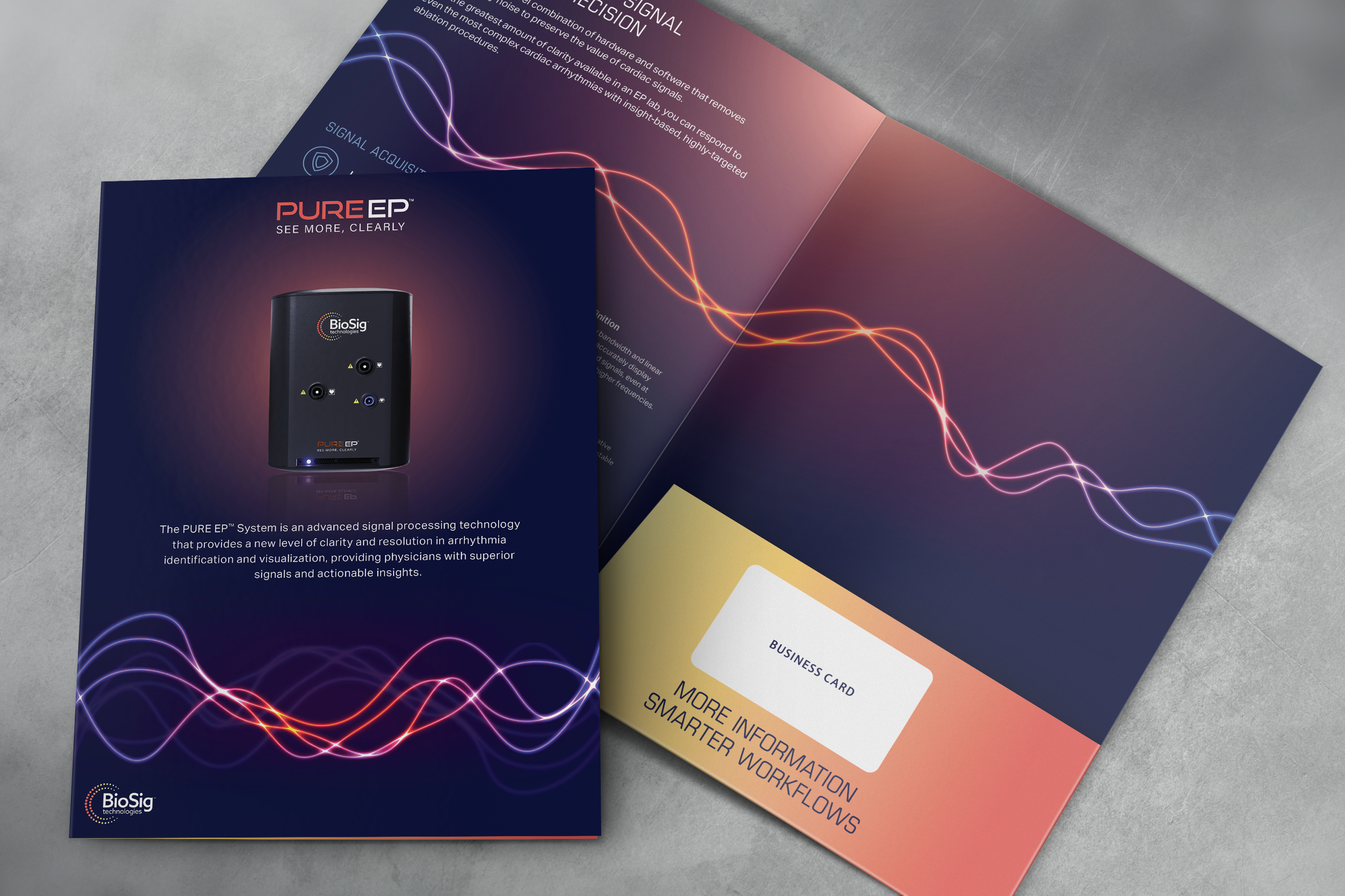

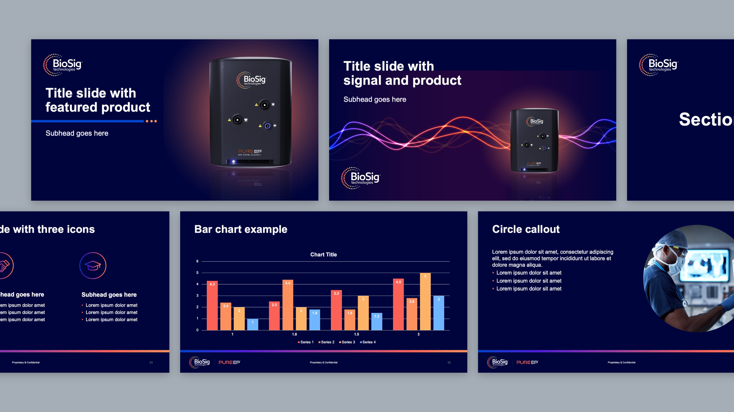
Part of the brand update was designing a versatile presentation template for PURE EP to use for sales reps and doctors. We ended up creating 30+ layouts for them, keeping it clean and simple so they will be able to easily explain complex technology.
Credits:
Creative Direction — Chris Haas
Messaging & Content Strategy — Maggie Bitner
Art Direction & Design — Hannah Shie
Design — Joanne Lundeen