

BioSig Technologies
Taking the visual brand to the next level
Brand Identity, Brand Guidelines, Logo Refresh, Iconography, and Presentation Design
-
BioSig needed to evolve from being perceived solely as a “heart signal” company to a wholistic "digital signal processing" company focused on providing the purest, clearest signals for the heart, brain and more. This shift aimed to focus their corporate market reach by targeting their investor audience.
-
A refreshed brand identity and visual framework were essential to support BioSig’s investor audience and reinforce their new positioning. To ensure consistency, it was critical to develop a comprehensive brand guideline document that would serve as an ongoing resource, enabling BioSig to present themselves cohesively and effectively within the MedTech industry.
-
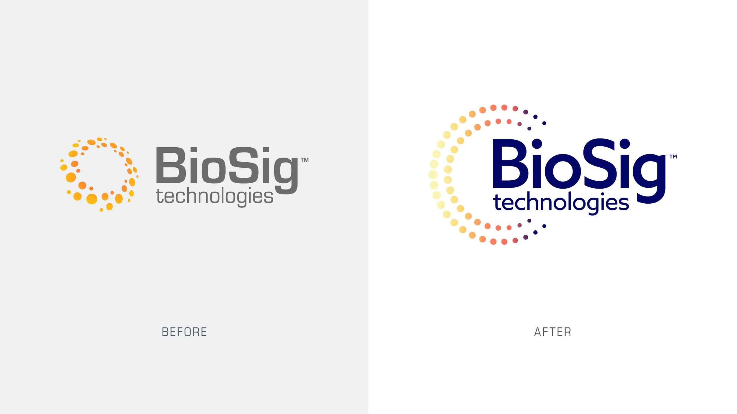
I leveraged personas and a refreshed brand identity to strategically tailor BioSig’s corporate brand for investors. Collaborating with the Creative Director and Copywriter, I developed a cohesive visual identity that aligned seamlessly with the new messaging framework. This included a logo refresh, updated color and typography, and a suite of design elements to bring the brand’s evolution to life. Additionally, I created a comprehensive 80+ page brand guide, detailing the new identity for BioSig’s corporate brand and the product branding for their PURE EP device.


The BioWave was developed as a signature visual element for the BioSig brand, symbolizing the company's innovative signal technology. This dynamic illustration seamlessly transitions from the particles in the logo to an electromagnetic waveform, embodying movement and fluidity. The BioWave effectively illustrates the brand in action, capturing the essence of BioSig’s cutting-edge advancements.

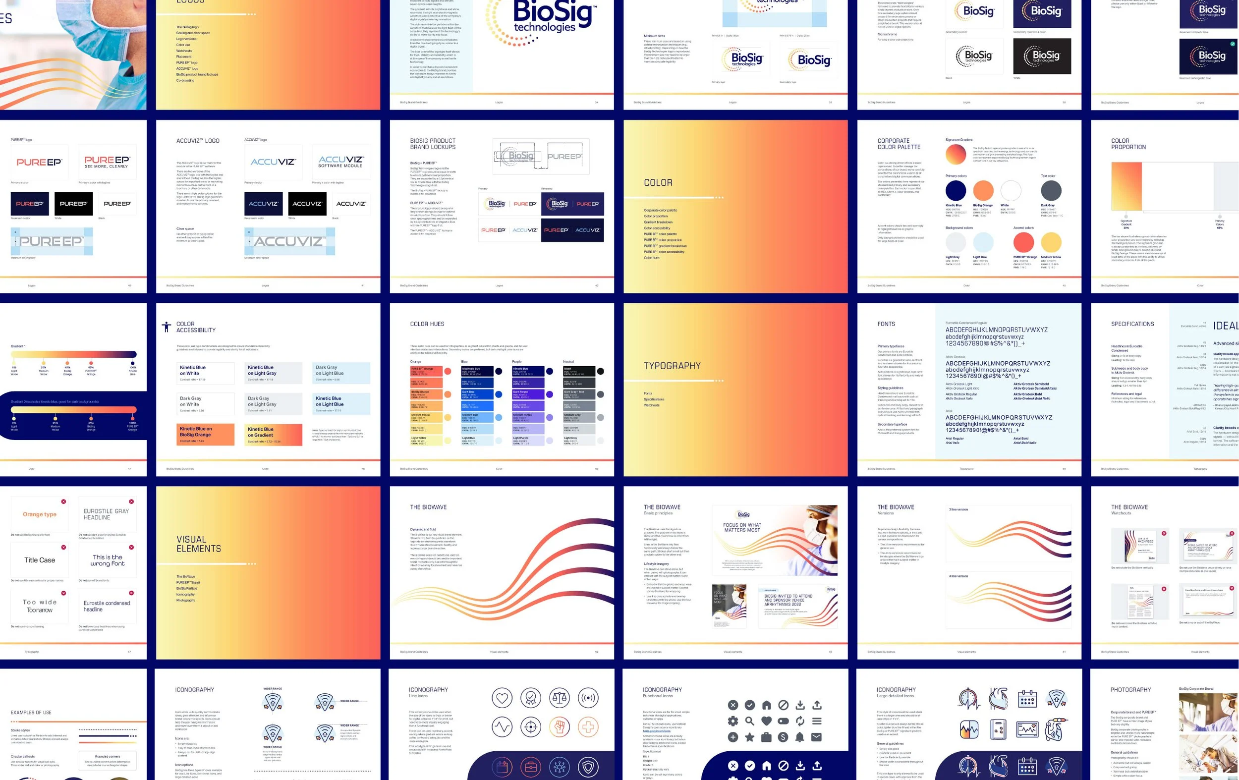
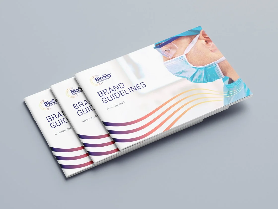
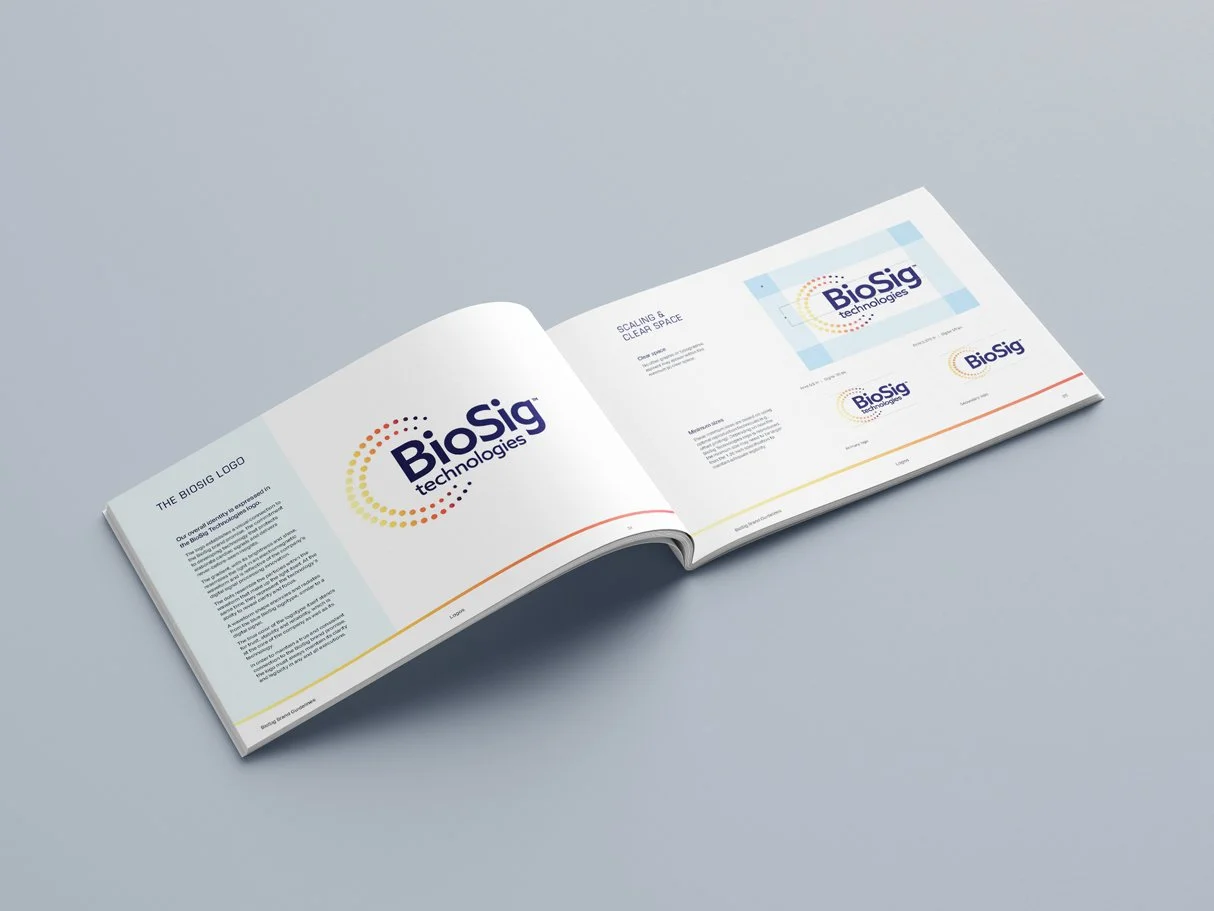
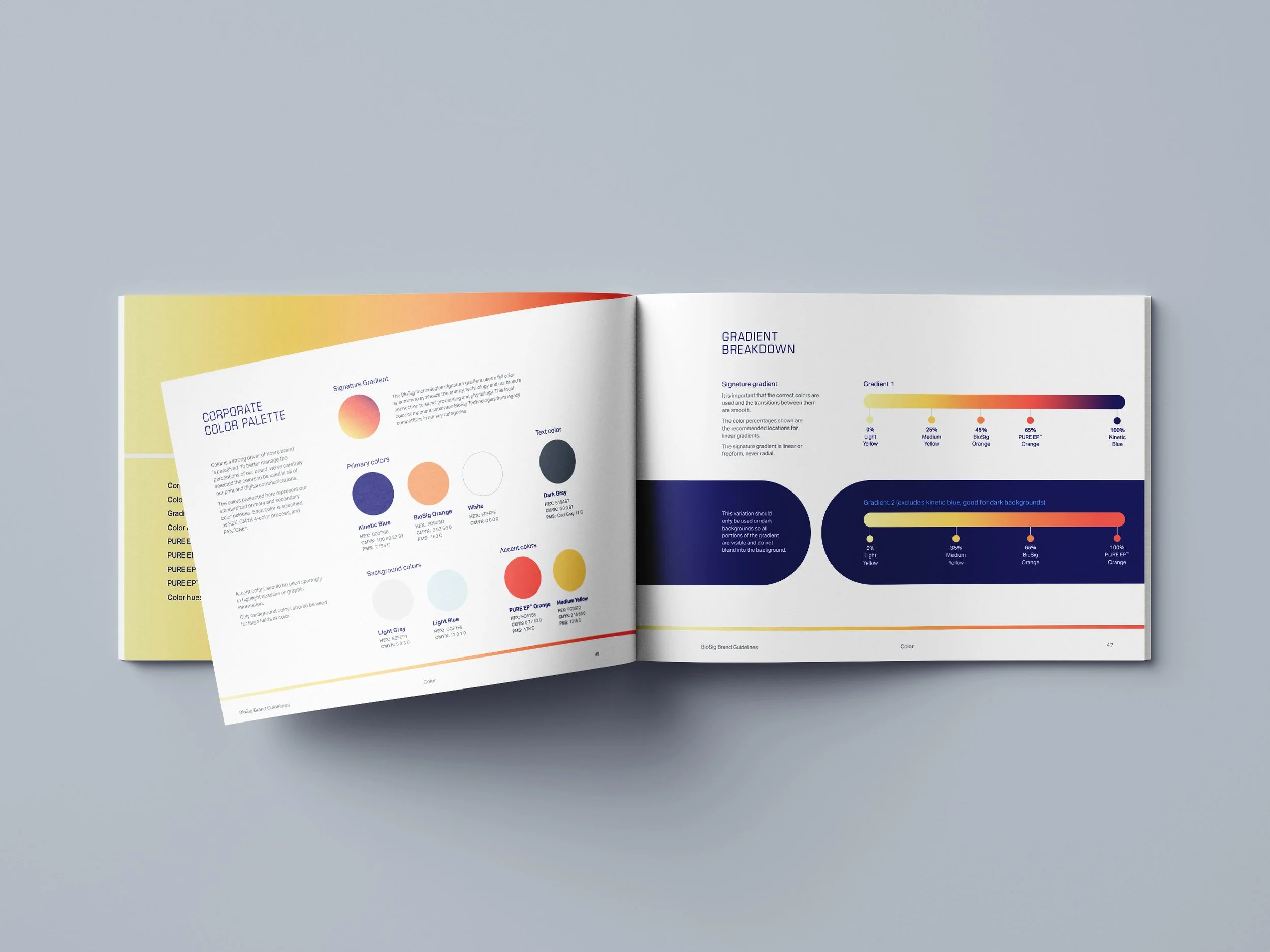
In the redesign of the BioSig brand, we produced a comprehensive 80+ page guidelines document. I spearheaded the design and direction of this guide, which included detailed instructions on logo usage, brand color theory, and specifications for visual elements such as the BioWave, iconography, and photography. This guide ensures consistent and cohesive brand representation across all platforms.


As part of the rebrand, we designed a versatile presentation template for BioSig to be used by investors, sales reps, and doctors. We created over 30 layouts, prioritizing a clean and simple design to facilitate the explanation of complex technological concepts. This ensures clarity and effectiveness in communicating BioSig's advancements.
Credits:
Creative Direction — Chris Haas
Messaging & Content Strategy — Maggie Bitner
Art Direction & Design — Hannah Shie
Design — Joanne Lundeen
Production Design — Brian Krause